
 Developing a workflow that lets you create web layouts quickly and easily while still satisfying your clients’ needs is crucial. In this Photoshop web design tutorial, I’ll show you a way to create a slick home page layout in the fastest time possible and with minimum web design skills. Let’s go!
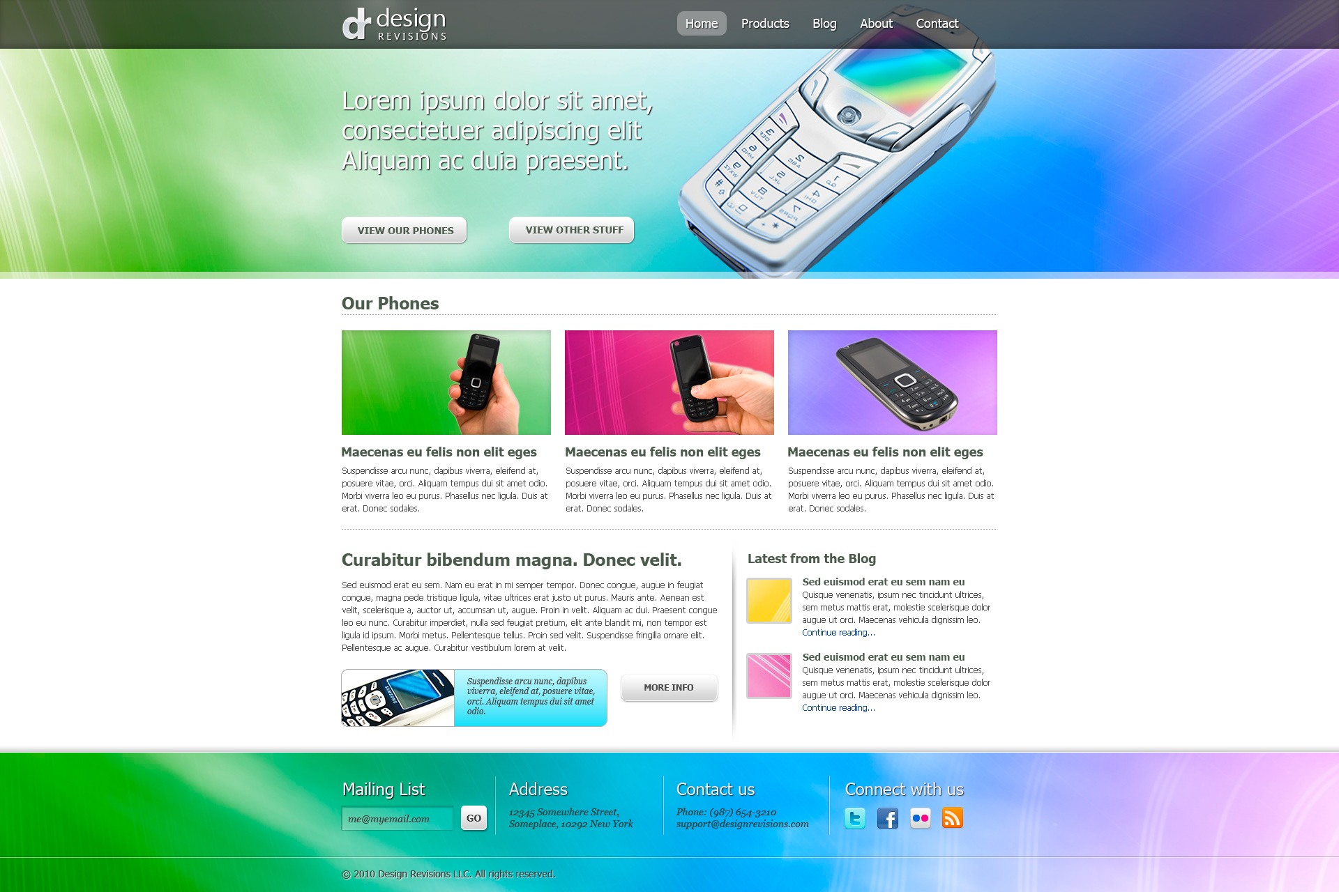
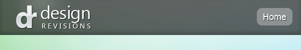
Preview
Click on the image below to see the final result in full size.
This tutorial is Part 1 of a tutorial series that walks you through the design and coding of a vibrant and professional web layout. Go to Part 2 afterwards if you would like to learn how to code the design.
- Part 1: Create a Vibrant Professional Web Design in Photoshop
- Part 2: Code a Vibrant Professional Web Design with HTML5/CSS3 ---- Next time
Tutorial Resources
- PSD: 960 grid system
- Background artwork: Color Background 1 by Flavio Takemoto (stock.xchng)
- Stock image: magic cellphone by Marcin Jochimczyk (stock.xchng)
- Stock image: Mobile phone 1 by Michal Ufniak (stock.xchng)
- Stock image: Mobile phone 2 by Michal Ufniak (stock.xchng)
- Stock image: Mobile phone 3 by Michal Ufniak (stock.xchng)
- Stock image: cell by Gail Rau (stock.xchng)
- Icons: Social Network Icon Pack by Komodo Media
Overview of the Layout
Let’s start first with a quick wireframe mockup (you don’t have to do this in Photoshop, you could just use pen and paper), as it would give us a bird’s-eye view of what we’re trying to create. Creating a quick sketch of a web layout would really help us plan our design layout wisely, and not leave us clueless midway through the design on which stuff goes where.
I usually do my mockups using a pencil and paper; but for this tutorial, I did it in Photoshop so that you could see what I initially envisioned.
You can also see that we’ll be using the 12-column variant of the 960 Grid System.

You can see that we have 5 major sections in our layout (header, featured, more products, more blurb, and footer). These sections are very common in websites.
Step 1: Set Up the 960 Grid System PSD
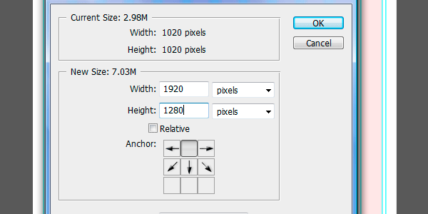
We’ll accommodate the large monitors in our design, but we’ll lay out our design so that it will be OK on smaller monitors. If you haven’t already, download the 960 Grid System zip file, extract its contents and, inside thetemplates\photoshop folder, open up 960_grid_12_col.psd.
We’ll enlarge the canvas size to 1920×1280px (from the original 1020×1020px). Do this by choosing Image > Canvas Size and put in 1920 and 1280 for the Width and Height respectively; also, choose the top-middle Anchor so that the expansion is equal on the left and right, and that it expands downward for the height.
Next, choose File > Save As (Shift + Ctrl/Cmd + S) and save the document on your hard drive, giving it a filename that you want. We’re doing this so that we can preserve our original 960 PSD template for reuse in our future web design projects.
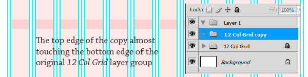
You’ll probably notice that our grid’s pink columns do not reach the bottom of the document. To fix this, just create a copy of the "12 Col Grid" layer group, unlock it, and then use the Move Tool (V) to drag it to the bottom of the document until the bottom and top edges of the two layer groups touch, holding down Shift to constrain movement vertically.
We now have our 12-column grid set.
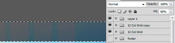
Next, unlock the original "12 Col Grid" layer group too, and adjust both layer group’s opacity to about 25%; this should make these columns fade into the background a little more so that the columns aren’t so distracting, while still serving as our visual aid as we place our elements on the page.
Remember to place all the new layers and groups we’ll create in the tutorial below the two "12 Col Grid" layer groups.
Step 2: Organize the Layers into Groups
Next, we’ll create the layer groups where our layers will reside. It’s up to you how you’ll name your layer groups (many folks refer to these as folders because the icon of a layer group is a folder); I’ve named mine according to the major sections I outlined in the wireframe mockup earlier (i.e. "footer", "more blurb", and so on). Note that I just combined the Featured section inside the "header" layer group for reasons that will become apparent later down the tutorial.

Compartmentalizing our layers into layer groups not only helps us organize our layers, but also gives us project milestones where we can measure our speed of creation and productivity against (e.g. If we’ve finished the header and more products groups, we’re about 50% done to project completion).
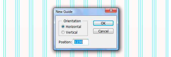
Step 3: Add Horizontal Guides
Let’s now divide our page using horizontal guides. Go to View > New Guide and create horizontal guides at these positions:
- 70px
- 400px
- 760px
- 1080px
- 1230px
These horizontal guides divide our page into the corresponding sections of the page (with the last guide dividing the footer into two).
Step 4: Add the Header/Featured Sections’ Background Image
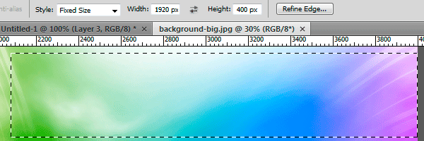
Now that we’ve set the boundaries of our sections, let’s start with the header/Featured sections’ background image. Normally, we would take the time and spend a considerable amount of effort creating a background for our page from scratch. But hey, let’s save some time and take advantage of the many free resources generously made available to us by talented artists. So, in order to save some time, I went to the stock.xchng website and looked for something that would suit my fancy. Bingo! I found an abstract artwork that perfectly satisfies our requirements: it’s large (4000×3000px), and looks cool. Download that image and open it up in Photoshop.
Next, choose the Rectangular Marquee Tool (M), go to the Options Bar and choose Fixed at the Style option dropdown menu and set the Width at 1920px and Height at 400px. This ensures that our marquee selection is pixel-perfect.
Use the Rectangular Marquee Tool to select an area of the abstract artwork you want (I chose an area somewhere at the bottom-right of the image), copy it (Ctrl/Cmd + C) and paste it (Ctrl/Cmd + V) inside the "featured" layer group in our main PSD.
Just move the image by dragging it with the Move Tool (V) or by using your Arrow keys so that it fits the space we allotted for it in the previous step, as dictated by the horizontal guides.
Step 5: Create the Horizontal Bar for the Logo and Navigation Menu
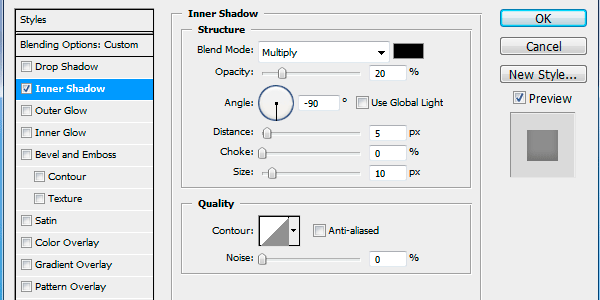
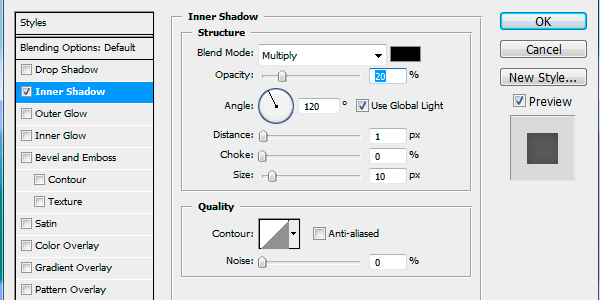
Let’s now create the dark horizontal bar that will serve as our logo’s/navigation menu’s background. On a new layer, choose the Rectangular Marquee Tool (M) again, select the whole area from the top to the first horizontal guide on the left, set your Foreground Color to black (#000000), then fill the selected area with your Foreground Color (Alt/Opt + Backspace/Delete). Set that layer’s Fill to 60%.
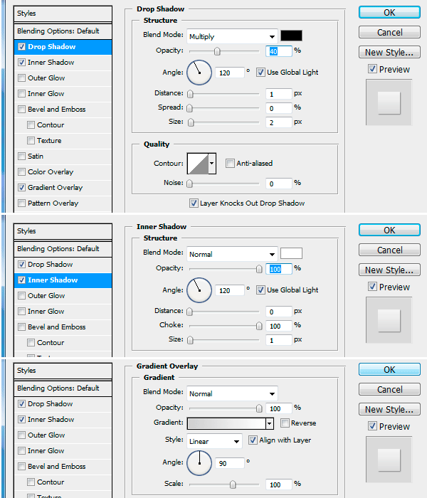
Add an Inner Shadow layer effect with the following settings:
Step 6: Create the Navigation Menu Items
Next, we’ll create the navigation and a "selected" button that indicates where the user is. To start, choose the Horizontal Type Tool (T) and, on a new layer starting with the 7th column, type in some menu items using 18pt regular Tahoma or any other sans-serif font that you like (just be consistent later on).
For my menu items, I wrote down "Home Products Blog About Contact" in one text layer.
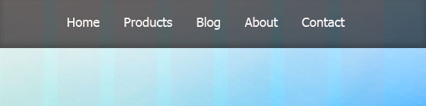
Let’s now create the "selected" button underneath the "Home" text (because we are laying out the home page). Choose the Rounded Rectangle Tool (U), set your Foreground Color to white (#FFFFFF) and set the Radius at 10px, then on a new layer, draw a button-like shape the surrounds the "Home" link; drop the layer’s Opacity to 30% afterwards.

Give the text layer a Drop Shadow layer effect using the following settings:
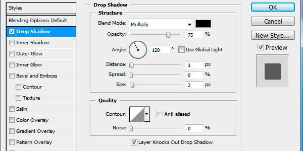
Once you’ve applied the Drop Shadow, you can also save it for later use and thus saving you a lot of time. To do that, open up the Layer Style window (double-click the layer where the layer style is applied) and click on the New Style button (just below the Cancel button). You will then be asked to give it a name, so think of a descriptive one. Any styles you save can then be accessed through the Styles Panel (Window > Styles).
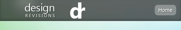
Step 7: Create the Site Name/Logo
Now let’s create the site name for the layout, which I chose to be "Design Revisions" (first word in "Design Instruct" and second word on "Six Revisions", the other website of Design Instruct).
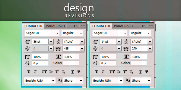
My font of choice for the site name/logo is Segoe UI (again, you can choose any font that you like, just use it consistently throughout the layout). Write down "Design" and "Revisions" on separate text layers using the Horizontal Type Tool (T); place both of them just over the grid’s first column with some space on the left side allotted for the logo’s icon (which we’ll add later).
Then apply the drop shadow layer style we saved in the previous step. After that, modify the character settings of each word in the Character Panel (Window > Character). Shown below are the settings for "Design" on the left and "Revisions" on the right. Afterwards, just nudge the words into position by using the Move Tool (V) and your Arrow keys.
Step 8: Create a Highlight Effect
Let’s now create a highlight over the site name/logo; a very common effect used to give the name of the website some distinction and emphasis. Create a new layer, choose the Gradient Tool (G), set it to Radial Gradient, choose white (#ffffff) as your Foreground Color, and choose the Foreground to Transparent gradient preset. Hold down Shift, and drag from the top of the dark bar, downwards; release when you reach the bottom edge of the dark bar. Drop the layer’s Opacity to 15%.

Step 9: Create a Simple Logo Icon
I’ll show you how I created the logo icon (that looks like "dr", the initials of the site name). Type a white "d" and "r" on separate text layers using 72pt bold Segoe UI. Move the two letters together so that their stems merge into one.
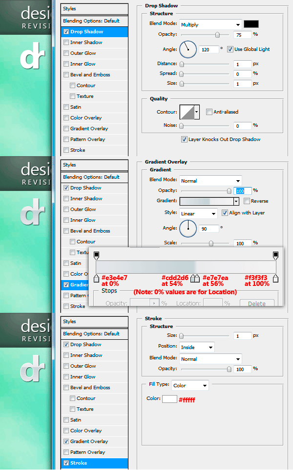
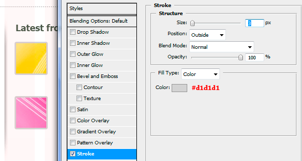
Merge the two layers (Ctrl/Cmd + E) and give the resultant layer a Drop Shadow, Gradient Overlay, and Stroke with the following settings:
Use Free Transform (Ctrl/Cmd + T) to reduce the size of our logo icon then use the Move Tool (V) to position it on the left edge of the first column on the grid.
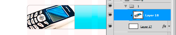
Step 10: Create the Featured Product
We’re now going to place in our featured product (an old-school mobile phone). Download and open the magic cellphone image in Photoshop. Isolate it from its background then copy and paste the phone on a new layer just below the dark bar layer.
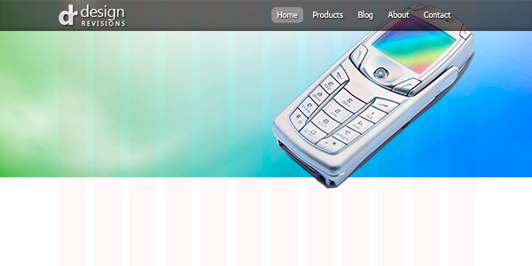
To keep things quick and easy, I didn’t do any modification to the image, except for adjusting its size and orientation using Free Transform (Ctrl/Cmd + T).
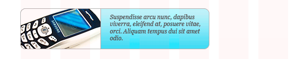
Step 11: Add the Site Blurb
Next, copy and paste in some Lorem Ipsum/dummy text or preferably some real text using 36pt regular Tahoma. Give this the drop shadow layer style we saved earlier.
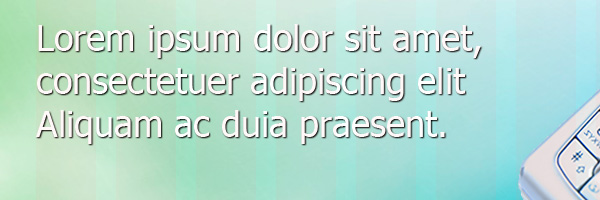
I also aligned the text block to the left edge of the first column.
Step 12: Creating Slick UI Buttons
Let’s now create the two buttons below the blurb text: Choose the Rounded Rectangle Tool (U), set the Radius at 10px and draw a button shape below the site blurb text. Give the button a Drop Shadow, Inner Shadow, and Gradient Overlay.
Add the button text using 14pt bold Tahoma with dark green (#505b4d) as the text color.
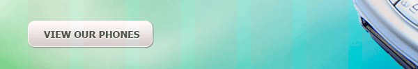
Next, we’ll create a copy of this button. Put the two layers of the button into a layer group by selecting them and holding down Shift before pressing the Create a new group icon at the bottom of the Layers Panel. Select the layer group and then press Alt/Option + Up Arrow key to duplicate the group (a handy keyboard shortcut). Position the other button on the right of the first one, then just edit its text layer.

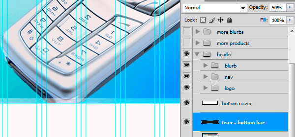
Step 13: Create the Translucent Bottom Bar
The process for making the translucent bottom bar at the bottom of the Featured section is simple: Make a short, wide rectangular selection that spans the width of the image, fill the selection in a new layer, then decrease the layer opacity. Start by creating a horizontal guide that’s 10px shorter than the Featured section’s bottom guide (400 – 10 = 390px for Position). Select the whole area between the two horizontal guides and fill it with white (#ffffff), then decrease its opacity to 50%.
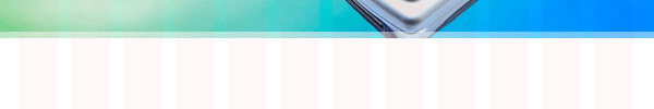
For the cover: on a new layer anywhere above the phone, you can create a white rectangle that starts at the 400px horizontal guide, and large enough to cover the bottom part of the image that sticks out. I named this layer "bottom cover."
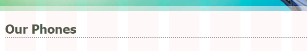
Step 14: Create the "Our Phones" Heading and Dotted Line Divider
We now go to the next section of the layout, which showcases the products (or services) on our website, represented by the three photos at the top, each with its own description.
Let’s create the heading first; I wrote "Our Phones" using 24pt bold Tahoma with the same dark green (#505b4d) color we’ve used. Using the Line Tool (U), I created a straight horizontal line below the text and applied a dotted stroke effect to the line using the Styles Panel (Window > Styles); the Style preset group I used is named "Dotted Strokes."

You’ll be prompted by a dialog box when you use the style preset; just choose Append. A set of dotted stroke effects is now appended to your Styles Panel. Choose any stroke effect you like. I chose the one with a grayish color.
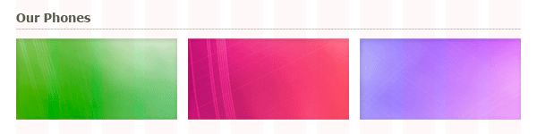
Step 15: Create the Color Backgrounds of the Photos
We’ll now make the backgrounds for each of our three products. Again, using the technique we used for creating the large background in the Featured section. Select three 300×150px areas in the abstract artwork, then copy and paste it to our main document. Note that each background is exactly 4 columns wide in the 960 grid.

After that, apply an Inner Shadow layer style to create a "frame" effect on the backgrounds (just apply it to one photo background).
Copy the same layer style to the other background by dragging the fx icon beside the layer name into the other layers (quick shortcut for copying and pasting layer styles).
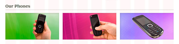
Step 16: Add the Product Photos and Description
Next, we need to place the product photos over each of the background. Download and open up these three stock images listed in the Tutorial Resources listing (Mobile phone 1, Mobile phone 2, and Mobile phone 3), isolate them, copy them into the main document, then resize them using Free Transform (Ctrl/Cmd + T).
Copy and paste the Inner Shadow layer style we used for their backgrounds in the preceding step so that the images also get the "frame" effect.
Next, we’ll add a heading and some text for the descriptions beneath the photos. I used 18pt regular Tahoma for the heading and 12pt regular Tahoma for the copy text under it with 18pt leading (which can be set in the Character Panel). I used dark gray colors for both: #505b4d for the heading and #4f4f4f for the copy text.
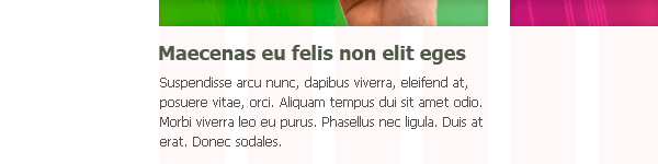
Duplicate both heading and text to create a second and third set of descriptions for the two other products.
Create a 760px horizontal guide and use it as an aid to help you create a dotted-stroked line divider like we did in a previous step.
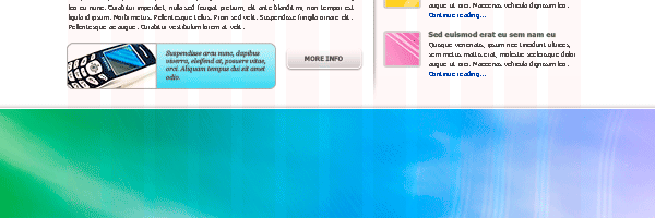
Step 17: Add the "More Blurbs" Heading and Copy
The dotted line divider we created in the last step separates the above products in our home page from the next section: The "More Blurbs" section, as I’ve named it. It contains a detailed description of a product and blog entries, which give more information to website visitors.
The blurb title is in 24pt bold Tahoma, also in that dark green color (#505b4d) we’ve been using.
Step 18: Add the Product Image, a Short Description, and a Button
We’re now going to create a product image with a short description beside it. One of the things we could do with this product image and short description is to rotate a few products that fades in and out using JavaScript or an Ajax library like jQuery.
Let’s start by creating the background for both image and text. Choose the Rounded Rectangle Tool (U) set at 10px Radius to draw the rounded rectangle box. Give this shape a Gradient Overlay using two shades of aqua colors: #7fe0f8 for the bottom color and #cef8ff at the top.
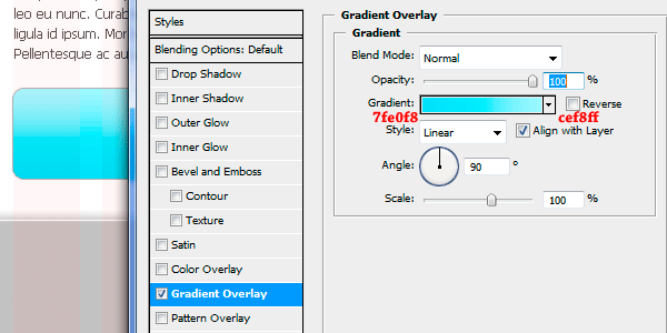
Give the layer a Stroke.
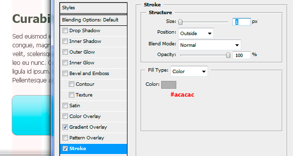
We need to place a selection around half of the shape (the left half) and fill it with white — this will serve as the background for our image. To do this, choose the Rectangular Marquee Tool, then press the Subtract from Selectionoption on the Options Bar and make sure that Style is set to Normal. Ctrl + click on the layer’s thumbnail in the Layers Panel then select its right half, so that it is subtracted from the selection, leaving us with just the left half selected.
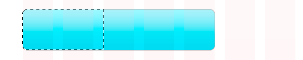
Create a new layer, and fill the left half of the rounded rectangle box with white, then give it a Stroke layer effect similar to the one we added earlier.
Download the cell stock image, isolate the phone, copy and paste the phone above the layer with the white fill. Adjust the phone into position, and resize it as needed. So that it doesn’t go outside of the white background, right-click on it and choose Create Clipping Mask from the menu that appears.
Next, we need to add some text on the right side of the rounded rectangle box. Here, I used 12pt italic Georgia with a gray text color (#4b4b4b).
Let’s add a button similar to what we have in the Featured section; just duplicate one of the buttons, resize it a little, and edit the text layer as needed.

Step 19: Create a Vertical Divider
Next, we’ll create the vertical divider that separates the blurb area from the blog entries on the right of the page. This is so easy to do: Choose the Rectangular Marquee Tool (M) and create a tall, rectangular selection where the vertical divider will be placed. Create a new layer. Set your Foreground Color to a gray color (#4b4b4b). Choose the Gradient Tool (G), set it at Linear Gradient and the Foreground to Transparent gradient preset, click-and-hold just outside the selected area and drag your mouse from left to right, to about a 5px width.
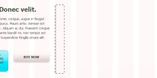
Next, we’ll erase the ends of the divider so that they appear to be tapering off. To do that, choose the Eraser Tool (E), set it at 0% Hardness and 200px Master Diameter, and use the Eraser Tool such that the tool’s outer edges touch one end of the divider. Click several times until you’re satisfied with what you see. Do the same for the other end.
Step 20: Add the Blog Entry Thumbnail Images
We now move on to the blog entries. Type a heading for the section, like "Latest from the Blog" using 18pt bold Tahoma. Grab two 60×60px backgrounds from our abstract artwork using the same method we’ve used before, and position them one on top of the other. Give both of the thumbnails a Stroke layer effect.
Step 21: Add the Blog Entry Headings and Excerpts
Add some text for the first blog entry. For the heading (the title of the blog post), I used 14pt bold Tahoma and our dark green color (#505b4d). I used 11pt regular Tahoma for the blog post excerpts using gray (#4b4b4b) for the text color. I added a "Continue reading" text in blue, to designate a link. Duplicate the layers for the second blog entry below it.

Step 22: Create the Footer Background
We’ll now go to our last section: the footer section. We’ll grab a 1920×200px area of the abstract artwork; select somewhere at the bottom of our previous selection to create a sense of continuity with the background in our Featured section. (create the selection somewhere in the bottom-right of the abstract artwork).
Place this in the exact position according to the horizontal guides, and we’re done with the background of the footer.
Step 23: Create a Horizontal Separator
Next, we’ll create the horizontal separator that divides the footer’s copyright information from the four sub-sections above it. This is easy to create: just put a 1px black line on top of a 1px white line, and reduce their layer’s opacity. To do this, let’s use the Single Row Marquee Tool since the line we’re going to create spans the whole width of the canvas. Click once along the horizontal guide for the separator, then hide our guides for the moment (Ctrl/Cmd + ;) so we can see our puny 1px line.
Set your Foreground Color to black (#000000) and hit Alt/Option + Backspace/Delete to fill the 1px selection. Create a copy of this layer, move it down 1px, below the black line, create a selection around it by Ctrl/Cmd + clicking on the layer’s thumbnail in the Layers Panel, set your Foreground Color to white (#000000) and hit Alt/Option + Backspace/Delete again to fill the selection with white (replacing the original black fill).

All you have to do now is reduce the layer’s Opacity to about 30% for the black line layer and 50% for the white line layer (these seem to be the best combination, but it’s up to you).
Step 24: Add the Copyright Info
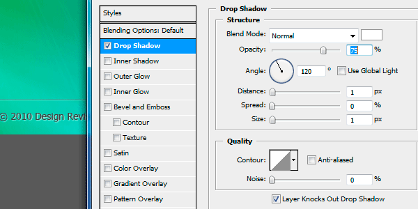
Next, we’ll just have to type in the copyright information. I used 14pt regular Tahoma and a semi-light gray color (#404040). I also added a "letter-pressed" effect by adding a Drop Shadow on the text layer (settings shown below).
Step 25: Add Footer Section Headings
Let’s create the first column of the footer section and start with its heading, and then we can just copy whatever we’ve created for the three other columns. For the first column, I just typed "Mailing List" using 24pt regular Tahoma in white, and added a Drop Shadow effect with same settings as the Lorem Ipsum/dummy text layer (just copy the layer style from it and paste it on this one).

Step 26: Create an Input Field and Submit Button
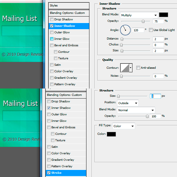
We’ll create an input field for submitting email addresses, and a "Go" button so that our users can subscribe to the mailing list. Choose the Rectangle Tool (U) and draw a small rectangle. Fill it with white and reduce the Opacity to 20%. Add a Stroke layer effect and an Inner Shadow layer effect to this layer.
let’s add a sample email address inside the input field (to let our site visitors know the input format we’re expecting) and a small "Go" button. I used 14pt italic Georgia with a gray text color (#404040) for the email address, and a small rounded rectangle (5px radius) for the button with the same layer style as the buttons we’ve created earlier.

Step 27: Create Vertical Separators
The vertical separators that split the four sub-sections of the footer is just a vertical version of the horizontal separator we created earlier: we just create two lines, one black, the other white, and reduce their layer opacity. But this time we need to use the Line Tool (U) because we need to be precise with the top and bottom ends of the separator. Once you’ve created the black (left) and white (right) lines, reduce their opacities to 30% and 50%, respectively.

Now, we just need to copy this vertical separator for the other sub-sections later.
Step 28: Duplicate the Headings and Add Some Copy
For the next two sub-sections, we need to add some text beneath the title. Just group all the layers for the first sub-section, drag two copies of it, delete the input field and "Go" button, then replace them with some text. I used 14pt italic Georgia with a gray text color (#404040) for the copy.

Step 29: Add Social Media Icons
For our last sub-section, we’ll just add the social media icons — this is our final step, I promise! From this free Social Network Icon Pack, grab the 32×32px icons for Twitter, Facebook, Flickr, and RSS. Open them in Photoshop, and copy and paste them into our layout. Arrange them accordingly using the Move Tool (V). Done and done!
Tutorial Summary
Take a look at our final result. Depending on your current workflow, some of the things we did might have slowed you down a bit (e.g. saving the styles and reusing them), but I’m positive that once you get used to these little shortcuts, they will definitely cut down your design time. Although we didn’t touch on it, there are other ways to speed up your workflow — e.g., creating Actions and other automation techniques in Photoshop, or saving other effects for later reuse (such as gradients and patterns). Just remember, don’t let the initial learning curve discourage you; because once you’ve turned these timesaving skills into habits, you’ll be creating web layouts in almost no time at all.
If you have any questions, please don’t hesitate to ask in the comments.
This tutorial is Part 1 of a tutorial series that walks you through the design and coding of a vibrant and professional web layout. Go to Part 2 afterwards if you would like to learn how to code the design.
- Part 1: Create a Vibrant Professional Web Design in Photoshop
- Part 2: Code a Vibrant Professional Web Design with HTML5/CSS3 ---- Next time


Really very informative post. I real this post and get a very important information.
Responsive Website Design
The blog was absolutely fantastic! Lot of great information which can be helpful in some or the other way
professional web design company | best graphic design services
The blog was absolutely fantastic! Lot of great information which can be helpful in some or the other way
top web design companies | best web design company
Positive site, where did u come up with the information on this posting?I have read a few of the articles on your website now, and I really like your style. Thanks a million and please keep up the effective work. direct marketing
Your very own commitment to getting the message throughout came to be rather powerful and have consistently enabled employees just like me to arrive at their desired goals.
Python Training in Chennai| Python Training course in Chennai
Datascience Training in Chennai |Datascience Training course in Chennai
RPA Training in Chennai |RPA Training course in Chennai
DevOps Training in Chennai |DevOps Training course in Chennai
AWS Training in Chennai | AWS Training course in Chennai
outsourcingall.com is a Porn Training site. outsourcingall.com is the largest Amateur porn training institute with the hottest selection Online and offline real life cam.
free bangla sex video dhaka
It's a wonderful post and very helpful, thanks for all this information about photoshop.i enjoyed reading it.Thank you so much.
Selenium Training in chennai | Selenium Training in annanagar | Selenium Training in omr | Selenium Training in porur | Selenium Training in tambaram | Selenium Training in velachery
Your very own commitment to getting the message throughout came to be rather powerful and have consistently enabled employees just like me to arrive at their desired goals.
angular js training in chennai
angular js training in omr
full stack training in chennai
full stack training in omr
php training in chennai
php training in omr
photoshop training in chennai
photoshop training in omr